
Brandi P
Author archive
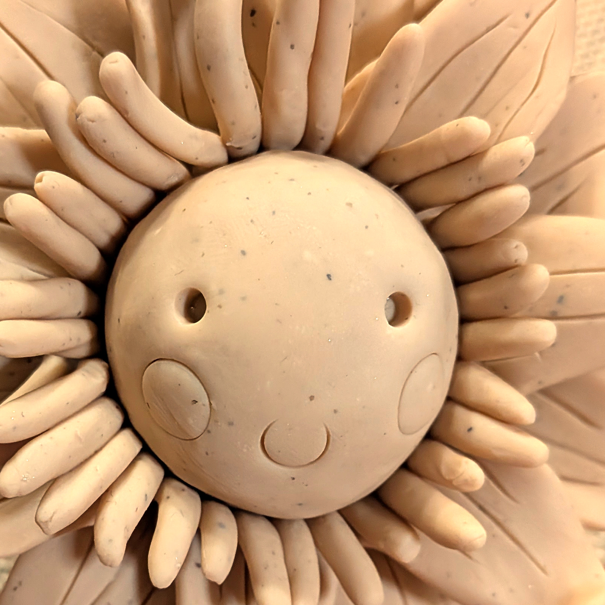
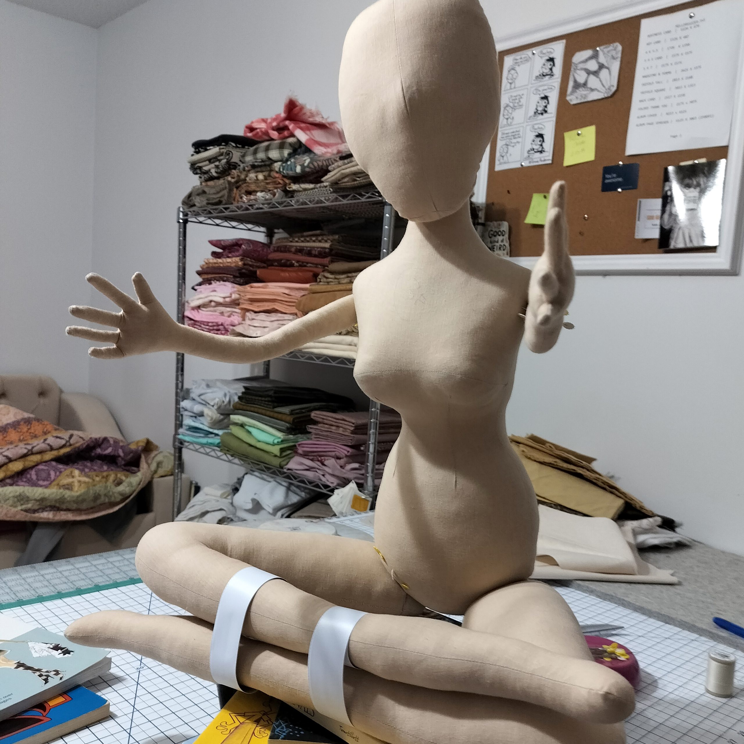
Attempt #1
July 14, 2026
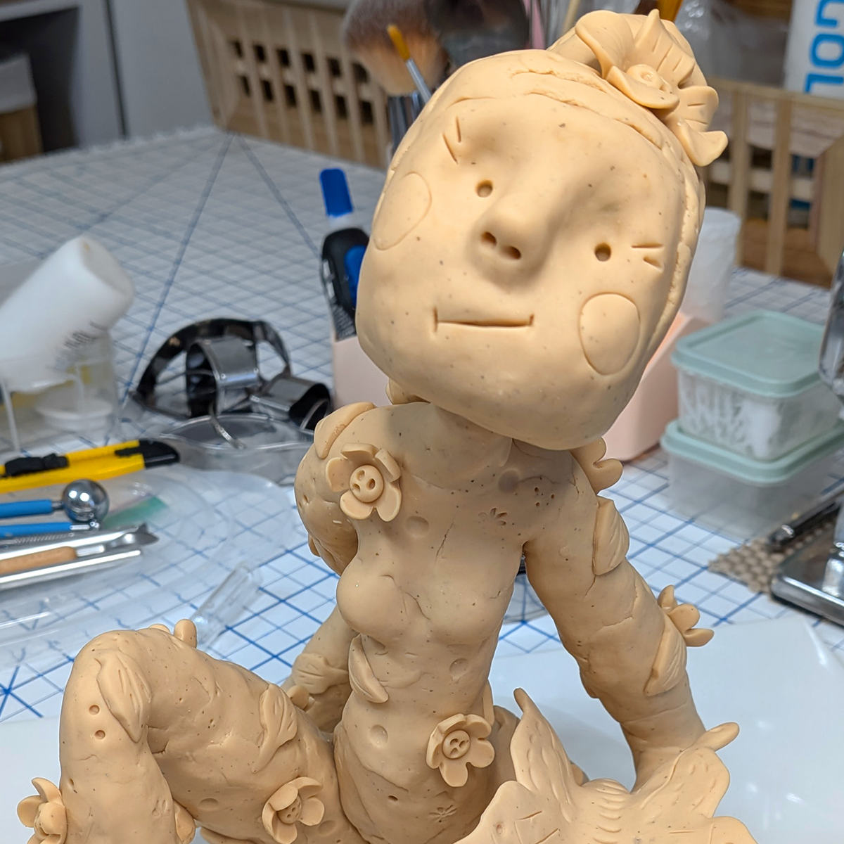
I have been creating flowers for a few months now and I am so excited about the world that I am creating. So much so that I have decided that I needed to have a version of me in there playing with my friends! So here I am working toward a version of myself for […]
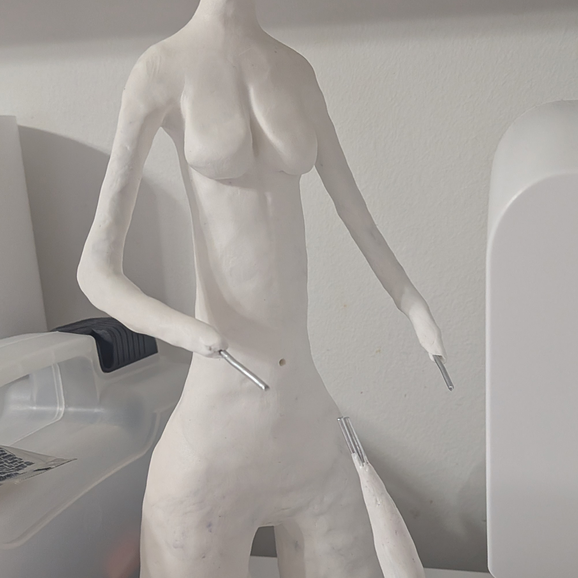
Almost There
April 9, 2026
Last year after in early March, I committed myself to creating sculpture in some way and I gave myself a soft goal of a year to get it together. Here we are in the last days of March and I am truly almost there. Most of the year was spent on fabric soft sculpture, but […]
Clay Days
February 8, 2026
Super excited to have the opportunity to continually evolve with my art. The older I get the more I know what I want and now I am working to get it. Is it taking longer than I would have liked, yes. But worth it. Not sure if I mentioned this, but I took a traditional […]
Still Working…
February 8, 2026
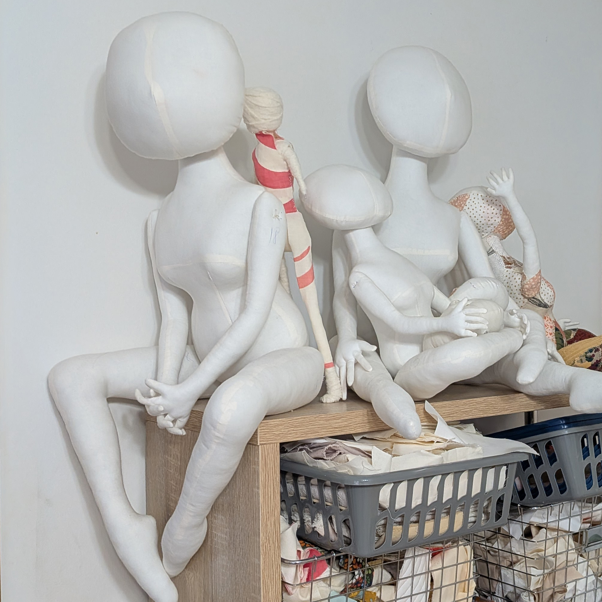
I know it has yet again been what feels like forever. I started working on soft sculpture in March of 2025 and here we are February 2026. Good News, I did master soft sculpture and the results good, but honestly the majority of my time on each piece was spent stuffing as my intent was […]
What’s New?
August 29, 2025
As usual, it has been a while. I have been focusing on my illustration business for a couple of years to pay the bills & enjoy more drawing time. I find myself consistently happy and content with my illustration work as apposed to my fine art which has been a roller-coaster ride for my mind […]